Hinge Dating App Review: What Is Hinge + How It Works In 2024

One of the dating apps I recommend to clients most often is Hinge.
It's popular amongst my single girlfriends, and guys ask me about it all the time, so let's explore what's good, and what's NOT so good, about Hinge 🕵
1. What is Hinge?
Hinge is like the Mercedes E-Class of dating apps.

- Hinge is classy without being pretentious. The app is intuitive to use, and quality people use it (not that a fancy education is all-important, but I read somewhere that Hinge's median user have a college degree).
- Hinge is versatile. An E-Class can transport five people and their luggage to the airport, or a couple to a classy dinner downtown. Likewise, regardless of your background, you'll find great singles on Hinge.
- You know what you’re getting. Mercedes Benz has an established brand, and so does Hinge. It’s been around since 2012, and claims it's “designed to be deleted,” i.e. Hinge users are generally seeking relationships, not hookups.
- Hinge ain't cheap. Like most apps these days, Hinge is borderline unusable unless you pay for premium features like Roses (more on this later!)
2. How does Hinge work?
Like most other dating apps, the Hinge experience centers around:
- Setting up your profile with ~6 photos and ~3 lines of text 📸
- Swiping on potential matches 📲
- Engaging matches via in-app chat 💬
Hinge is unique in that instead of a written bio, you're required to respond to 3 pre-written question “prompts" that are designed to stimulate conversation.
(Unique isn't quite the right word — other apps have copied Hinge's prompt feature, but Hinge was the first to use prompts as far as I'm aware!)
Here are examples of Hinge's prompts:
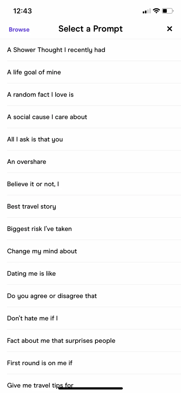
Hinge offers 75 prompts to choose from! A few of my favorites:
- 📍 “I know the best spot in town for…” (opportunity to spotlight local expertise, and can lay up a date)
- 🧠 “I’m convinced that…” (opportunity to highlight your sense of humor, and start conversations)
- 💭 “A life goal of mine is…” (use this to showcase something important to you, but keep it playful!)
Hinge supports video and audio responses to prompts.
That is to say, you can upload a short video of yourself, or an audio recording of yourself, in lieu of a text or photo response to a prompt.
In general, I don't recommend video and audio responses to prompts — they're easier to screw up than to get right — and girls won't look down on your profile if it's just photos and written text, but if you have a great video to share, go for it 📸
Anyway, when you create your profile, you’ll also have the choice to share personal details like your:
- Age
- Height
- Education level
- Ethnicity
- Occupation
- Religion
- Political views
… and much more.
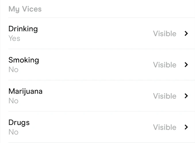
I usually encourage clients to share their age, height, education, and work only.
Women can often infer everything they want to know about these traits from your photos, but listing them explicitly builds trust.
Information about your "vices," like drinking and drug use, can be TMI before you’ve matched, though, and ignores important nuances about your lifestyle and beliefs 😬
Many guys have told me you can increase your chances of compatible Hinge matches by removing "vices" and other info like political views from their profiles!
Anyway, once your profile’s set up, it’s time to land some matches.
Like most other dating apps, Hinge will show you a single-file queue of potential partners who meet your criteria (you can specify age, location, and lifestyle habits).
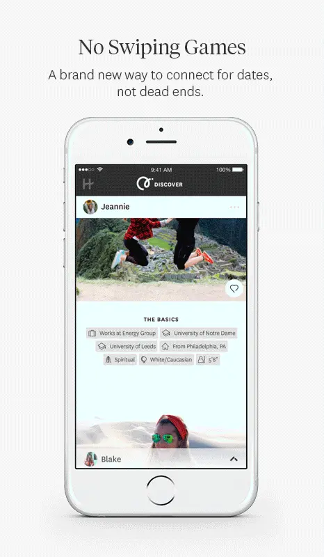
What distinguishes the Hinge experience is that you don’t just “swipe” on profiles you like — you have to engage with a specific element in them.
For example, you must reply to one of your potential match's, or choose one of their photos to “like” by tapping the heart icon (with the option to include a note).
I personally love this, because it moves the conversation in a specific direction:
- Why do you like her photo?
- What makes her prompt response funny?
In reality, this feature doesn’t prevent users from matching and using generic and boring opening lines like “hey what’s up?”
But it’s a thoughtful step in the right direction 😇
Hinge has another queue where you can view users who’ve already “swiped right” on you (and read their messages, if they sent you one when they swiped).
If you swipe right back, you’ll move over to the match queue, where you can review and chat with your matches:
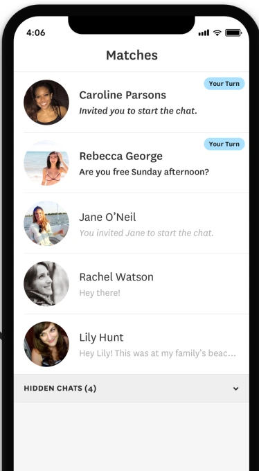
The protocol for chatting with your matches on Hinge is the same as on most other apps:
- Swap a few text-based messages within the app 💬
- Transition things to SMS (and a date!) as soon as the connection’s established 📲
During the pandemic, because people were hesitant to meet up in-person, Hinge added audio and video chat functionality.
Some of my friends used these features when they launched, but as the Coronavirus saga has wound down, most have reverted to the usual “swap a few messages, then exit the app” flow.
(Quick tangent — wondering how to spice up your Hinge chats with photos? Check out my guide on how to send a photo via Hinge for the answer!)
3. Who is Hinge for?
Hinge is great for most singles:
- It has a high-quality audience, but isn’t exclusive like Raya
- It’s oriented toward dating, not hookups, but isn't too serious
Hinge’s Audience 👪
Like I mentioned earlier, I've seen Hinge tout some statistic about how the majority of its users are college-educated, working professionals.
Regardless, I’ve been impressed with Hinge’s audience from an engagement standpoint...
There are fewer fake or abandoned profiles on Hinge vs other apps in my experience!
I think this is because Hinge nails:
- Branding itself. Hinge’s slogan is “designed to be deleted", which resonates, because no one actually likes online dating 😅
- The signup experience. Hinge requires enough effort to onboard that lazy creeps and scammers won’t bother, but not so many questions that normal users are scared off 😃
- The ongoing user experience. Hinge takes trust and safety complaints seriously, and gets bad actors off their app fast 👋
Hinge User Intent 😏
I use the term “intent” to describe where on the relationship-seriousness spectrum a dating app’s audience tends cluster.
- “Low intent” means the app’s audience is more hookup-oriented (e.g. Tinder, though the most extreme example I can think of would be Grindr!)
- “High intent” means the app’s audience is more relationship-oriented (e.g. Match.com, or an actual matchmaking service)
Hinge’s audience is medium-to-high intent.
In my experience, Hinge users are looking to date (vs casually hook up, or immediately hop into long-term relationships...)
This is a good thing. It means you won’t waste time engaging with people who only want to fool around, nor will you consistently be saddled with desperate “must-get-married-ASAP” matches 😬
4. When Can You Use Hinge?
Like most dating apps, Hinge is:
- On-demand which is to say you can swipe whenever you want, and there’s no special timing element (e.g. “you can only meet or engage with potential partners Sundays at 12pm”) ⏲️
- Usage-capped in that Hinge cuts you off for the day once you’ve “liked” a certain number of profiles, and doesn't even allow you to swipe on certain "standout" profiles without paying 🧢
You can purchase a premium Hinge membership for $20-50/month (pricing depends on the features you want, and how long you're willing to commit) to unlock:
- Unlimited daily swipes 📈
- Visibility into everyone who’s "liked" your profile 🤩
- Roses, which allow you to match with and message "standout" profiles 🌹
The membership options change often, so I won't outline them here.
TLDR if you're serious about finding a partner on Hinge, you probably want to pay for a premium membership that removes restrictions on who you can swipe on / message, and where you can swipe 💸
On that note...
5. Where Can You Use Hinge?
Hinge has users all over the world, though it’s not as popular outside of the U.S. as Tinder.
Like most other dating apps, Hinge’s userbase is densest in cities.
And like most other dating apps, you can specify a “location radius” outside of which you won’t consider potential matches (e.g. <10 miles, <25 miles, or <50 miles from your location).
Basically, Hinge is great if you’re located in any major metropolitan area in the United States 🌆
On this note, I love that Hinge allows you to choose your location by default.
This means you can meet potential matches somewhere you’re not physically located, without paying for a premium membership 📍
One other callout about Hinge’s location service is it’s ultra-specific. Hinge displays your neighborhood of choice, not just your city, to potential matches!
6. Why Should You Use Hinge?
If you’re looking to date, Hinge is one of the best places to start online.
I recommend Hinge to almost all of my clients if they’re not on it already ☑
Several of my girlfriends don’t use any dating apps outside of Hinge!
However if you’re only interested in:
- Casual hookups 👉👌
- Ultra-serious relationships ASAP 👰
- Partners who meet ultra-specific criteria (e.g. specific religious belief) 🦄
… Hinge may not the best dating app for you.
Anyway, give Hinge a try for yourself, and let me know what you think!
Wrap up & next steps

One last word for the wise...
You’ll find awesome women on literally every mainstream dating app: Tinder, Bumble, Hinge, Raya, OKCupid, Match.com, Zoosk, Coffee Meets Bagel, BlackPeopleMeet.com, JDate, etc.
☝️ Your profile across all these dating apps is essentially the same.
What do I mean?
Whether you’re using Hinge, Plenty Of Fish, Raya, or another app, you’ll need some combination of the following to showcase who you are, and what you're about:
- 6 photos 📸
- 3-6 sentences of written text 📝
Where I'm going with this is...
What dating apps you use (e.g. Hinge vs Bumble vs Tinder) matters about 1/100th as much as the quality of your profile.
Why?
- You'll use the same photos and text to construct your profile regardless of what app you use ⚒️
- Many women use multiple dating apps (i.e. you're likely to see the same women on Bumble and Hinge) 👯♀️
- There are awesome women on all dating apps (i.e. just because some women only use Match.com and others only use Raya doesn't preclude you from meeting someone great on Hinge) 🤷
Basically, you don't need to be on EVERY dating app (or a specific dating app) to meet someone you like online.
You're better off improving your photos and your copywriting skills, so you stand out on whatever apps you're using today!
This same principle applies to paid features like roses 💸
Paid features might get you +1 or +2 matches per month.
If +1 or +2 matches per month sounds great, and you won’t miss the $20 (or whatever the add-on costs), don't let me stop you.
But the impact is negligible compared with the +100 or +200 matches you’d get per month by simply improving your profile 🙃
Make sense?
And if you're ready to improve your profile, check out my ideas below!
Idea #1: Unlock my best FREE guides
the Dating starter kit
Snag my 4 essential guides (and my best resources) to reignite your dating life no matter where you're starting from.
Idea #2: Follow me on Instagram
Join 600,000+ guys for dating tips on Insta every damn day! Don't be the jabroni who misses out 🙄

